
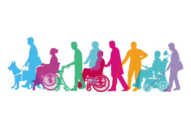
This project is focused on offering a better quality of life for our disabled citizens in Turkey. The main reason I have felt the need to create this platform because I have realized how hard life can actually become for disabled people. In order to create this platform, I have to do a very long research on the places where there are areas accessible for disabled people.
Down below, there are my research questions, thinking and designing steps and planning.
My vision for this project is that after I succesfully launch the app for Turkey, I want to slowly increase the variety of places by time. My end goal is to create a worldwide app which makes the life of disabled people easier. By time, I also would like to add other features to my websites such as sensory friendly spaces that are more quiet or less crowded that are available for the special needs people. Sensory friendly spaces must be designed considering the overwhelming factors such as noise, lighting, corwds, smells or visual clutter. Finding a place which would not disturb the person can be really hard when there are no helping tools to search from. The platform will locate the appropriate places nearby and will make reccomendations. Of course, this is a very wide topic and that is why I can improve and add new features to the app.
RESEARCH
Reaserch questions;
Are there any other platforms who did this?
What are the weaknesses of these platforms?
How can digital tools help people find spaces in cities?
What makes a place disability friendly?
What features should a disability friendly app include?
How can urban sensory data be used to design tools that help people navigate cities more comfortably?
Yes, there are some platforms that try to help disabled people find accessible places. Some apps allow users to mark locations that have wheelchair ramps, elevators, or accessible restrooms. In addition, large map services sometimes include small accessibility details such as wheelchair-accessible entrances.
However, most of these platforms mainly focus on physical accessibility. They usually do not include information about sensory conditions such as noise level, lighting, or how crowded a place is. Because of this, people with sensory sensitivities may still struggle to find suitable environments.
Another problem is that many platforms focus only on one type of disability, usually mobility disabilities. They rarely consider other needs such as sensory sensitivity, autism, or anxiety in crowded environments.
Also, some platforms are not designed in a very simple or clear way, which can make them difficult for some disabled users to navigate.
Digital tools can help people understand what a place might be like before they visit it. For example, an app could provide information about how busy a place usually is, whether it is quiet or loud, or if the lighting is very bright.
Many digital platforms can also collect user experiences. People who visit a place can share their observations, such as whether a café is calm during certain hours or whether a public area becomes crowded in the evening.
This type of information helps people choose environments where they feel more comfortable and avoid places that may be stressful or overwhelming.
A disability-friendly place is a place where people with different needs can move around and use the space comfortably.
For people with mobility disabilities, this may include ramps, elevators, wide entrances, and accessible restrooms. Clear signs and simple layouts can also help people navigate the space more easily.
For people with sensory sensitivities, it is important that the environment is not too overwhelming. Very loud noise, flashing lights, or extremely crowded areas can make some spaces uncomfortable. Quieter areas and calmer environments can make a big difference.
Urban sensory data can provide information about environmental conditions such as noise levels, lighting, and crowd density in different areas of a city.
If this information is included in digital tools, users could plan routes that avoid very noisy or crowded places. This would help people who are sensitive to sensory stimulation move around the city more comfortably.
Over time, collecting this type of data could also help designers and city planners understand which areas need improvements to become more inclusive.
What should the app include?
v These apps should be easy to use. It should be clearly organized and the design should be simple so users can quickly find the information they need.
v The app should include features such as maps showing accessible places, filters for different accessible needs, and user reviews describing the conditions of locations.
v It should also include navigation that helps users find accessible routes.
v Another key feature is allowing users to add information themselves, because accessibility conditions in cities can change other time.
WEBSİTE THEME & DESİGN CONCEPT
I plan on launching it as a website at first and then turn it into an app since I am more familiar with websites and I find it easier to manage.
Theme
The theme of the sebsite will focus on simplicity, calmness and accessibility. This design should help users to quickly find information without feeling overwhelmed. Because some users may have sensory activities, the interface and the color allete overall will avoid too bright or harsh colors and instead use soft tones and clean layouts with a neutral color pallets. The website will have a minimal and intuitive structure that allows users to easily search locations in cities. The main goal of the design is to make the platforms design is to make it easy to use, comfortable, inclusive and easy to navigate for everyone.
Style
§ Minimal
§ Calm
§ Modern
§ Accessible
§ Easy to read
Things to avoid
§ Flashing elements
§ Very bright neon colors
§ Cluttered pages
§ Confusing structure
Color Palette
Primary Color
The primary color would be light blue/ baby blue that represents trust and calmness. Hex: #4A90E2
Secondary Color
Soft Mint Green → represents accessibility, safety, and comfort Hex: #6FCF97
Background Color
Very light grey (easy on the eyes) Hex: #F5F7FA
Text Color
Dark grey (not pure black because black can be harsh) Hex: #2F2F2F
Accent Color
Soft warm yellow for highlights Hex: #F2C94C
Typography (Fonts)
Choose simple and readable fonts.
Heading Font
Poppins
Body Text
Open Sans or Inte:
- very readable
- accessible
- commonly used in UI design
Layout Structure
Homepage
Top section:
- Logo
- Search bar (Find accessible places)
- Map preview
Main sections:
• Search accessible locations
• Filter by needs (wheelchair, quiet, low lighting)
• Recommended places nearby
Bottom:
• Community reviews
• Add a place
Accessibility Features in the Design
The interface itself should be accessible.This is the one key thing that the users will be looking for in the app. There are important things I have to be adding to the platform. These are things such as;
• High color contrast for readability
• Large buttons and icons
• Clear symbols
• Simple navigation
• Optional dark mode
• Adjustable text size (for people that have a hard time to see)
Icons Style
Icons should be simple and universal. In my opinion, the icons should have like their own dictionary so people would be able to understand what they are. These should be located int the interface of the website and would promote an easier use for people who did not understand the symbols provided. There are some examples down below (universal, easy to understand)
♿ wheelchair accessibility
🔇 quiet place
💡 low lighting
🚻 accessible restroom
Using rounded icons to keep the design friendly and soft can be a good strategy since using sharp edges and features can look overwhelming for users.
Overall Aesthetic
The overall aesthetic should feel:
Calm
Safe
Inclusive
Organized

This is a truly inspiring initiative. The idea of integrating urban sensory data — such as noise levels, lighting conditions, and crowd density — into an accessible mapping platform goes far beyond what existing tools like Google Maps offer. Most current solutions only address mobility-related accessibility, so the focus on sensory-friendly environments is a much-needed innovation. The proposed use of crowdsourced reviews to keep data current is also a brilliant approach to scalability. I look forward to seeing how this platform evolves from a website into a full app.
What a thoughtful approach to design thinking and disability access. I particularly appreciate the emphasis on the UI/UX considerations — choosing a calm blue and soft green color palette, using Poppins and Open Sans for readability, and ensuring high-contrast combinations. These details show a deep understanding of how design choices directly impact usability for people with diverse needs. The universal icon dictionary is also a wonderful touch that could set a new standard for inclusive digital interfaces.
The research objectives outlined here are incredibly well-structured. Identifying the gap in sensory data coverage across existing platforms like Google Maps and Apple Maps is a critical first step. The concept of predictive crowd and noise level analysis is particularly exciting — it could leverage machine learning models trained on historical foot traffic data to provide real-time recommendations. Route planning that accounts for sensory stressors is something I have not seen in any mainstream navigation tool, and it could genuinely transform daily life for neurodiverse individuals.
As someone who works in urban planning, I find the proposed website structure remarkably well thought out for a 9th grade project. The homepage layout with a location search bar, mini map preview, and sensory filter options mirrors professional-grade accessible design patterns. The community features — particularly the public reviews system and place submission interface are essential for building a living, evolving database. Starting with Turkey and planning for global expansion shows real strategic vision. I would love to see this platform incorporate partnerships with local municipalities for official accessibility data.
This project beautifully demonstrates how architecture and technology can intersect to create meaningful social impact. The decision to include features like multi-filtered location search covering mobility, sensory, and lighting needs reflects a holistic understanding of accessibility that goes well beyond compliance checkboxes. I am also impressed by the responsive text scaling and optional dark mode toggle in the accessibility standards — these are features that even many established tech companies overlook. The fact that this comes from a design thinking perspective rooted in real-world observation makes it all the more compelling. Excellent work on Accessible Space!
This is really helpful, thanks for sharing!