How Our Granola Brand Was Born: From a Family Habit to a Sister-Founded Brand
Clean eating has always been a big part of my life. No matter where I go, I always look for the healthiest food options I can find. Because of that, granola has always been the main character of my breakfasts and snacks. Whether it was with yogurt, fruit, or just by itself, it was something I ate almost every day.
But in our house, there was one funny pattern: the thing we ran out of the fastest was always granola. We would finish it so quickly, and the good ones were always expensive. After a while, I started thinking… why don’t we just make it ourselves?
So I began experimenting in the kitchen. At first it was just for fun — trying different combinations of oats, nuts, and flavors. I spent a long time testing different recipes and adjusting the taste. My family became my first taste-testers, and soon my friends started trying it too. Every time I made a new batch, people loved it. That was the moment I realized this could become something more than just a homemade breakfast.
What made the idea even more special was our family background. We already have a family business connected to local food and dairy. We believe strongly in eating local, natural foods, and we produce dairy products that people enjoy with their breakfasts — especially yogurt. One day we realized something interesting: the only breakfast item we weren’t producing ourselves was granola. Yet we actually had everything we needed on our farm to make it — oats, nuts, seeds, and natural ingredients.
That realization sparked the idea of creating our own granola brand.
My sister and I decided to build it together, becoming the co-founders of the brand. From the beginning, we wanted it to feel personal, creative, and connected to our story. We didn’t just want to sell granola — we wanted to build a brand that reflected our lifestyle and values.
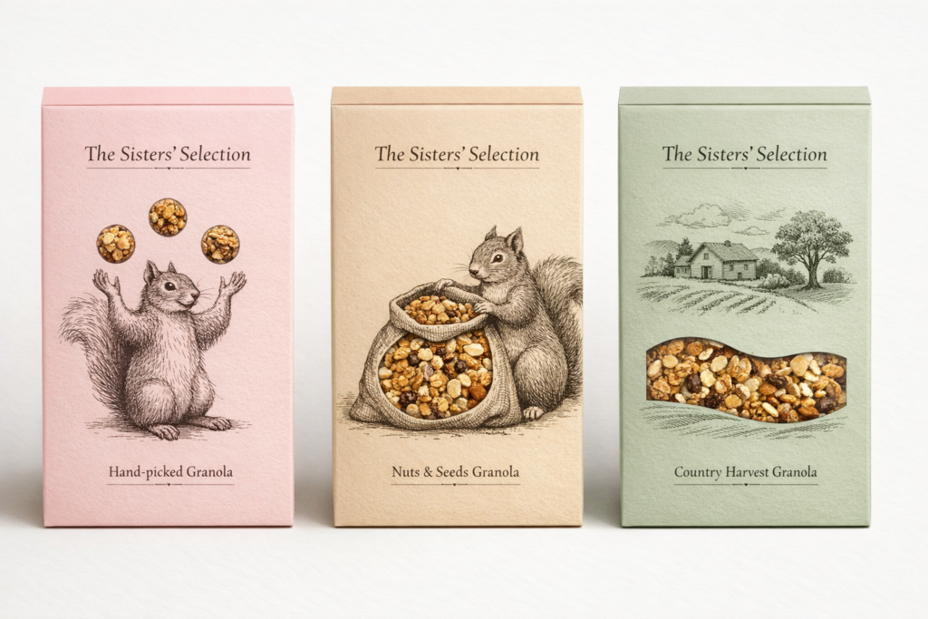
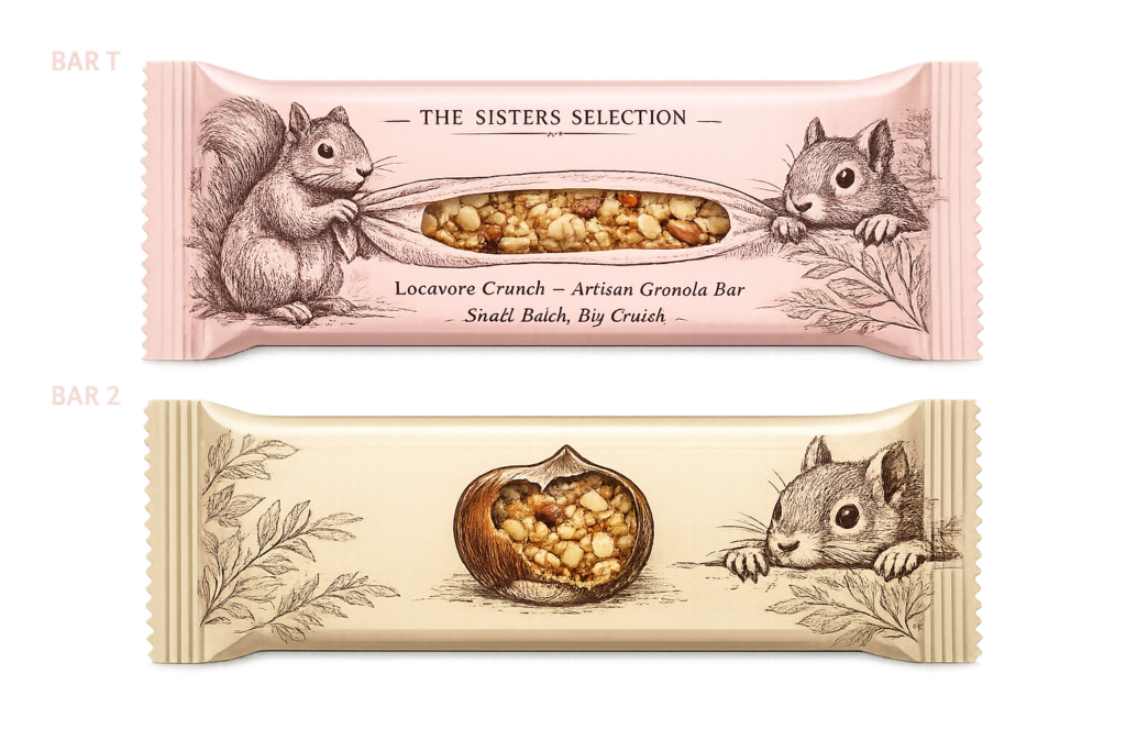
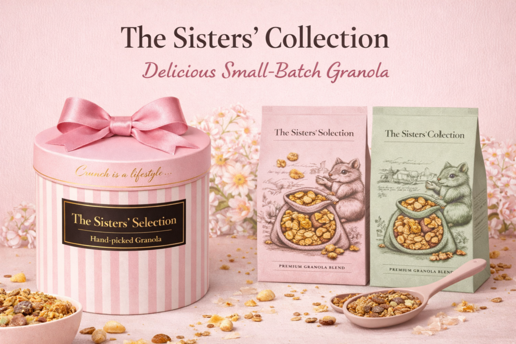
One of the most meaningful parts of creating the brand was designing the visual identity. While working on the logo and packaging, I kept coming back to one symbol: a squirrel.
When I was little, my father always used to call me “squirrel.” It was a small nickname, but it stuck with me for years. So when we started thinking about the personality of the brand, the squirrel felt like the perfect symbol to include.
It also made sense in another way. The ingredients we use in our granola — nuts, seeds, oats, and other natural foods — are actually very similar to the foods squirrels gather and eat in nature. That connection made the squirrel feel like the perfect representation of the brand: natural, playful, and connected to the outdoors.
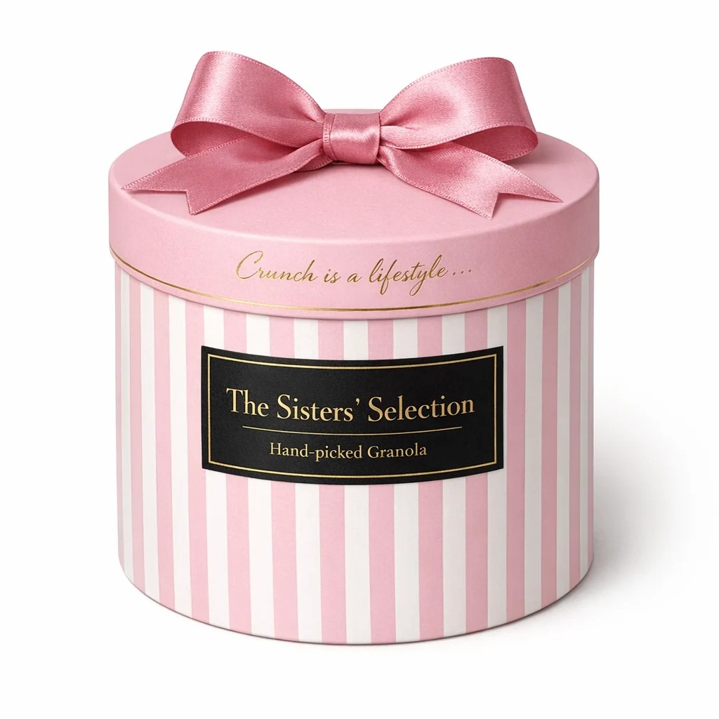
Instead of making the squirrel just a simple logo, we wanted to make it part of the entire experience. When we designed the packaging, we thought about how the squirrel could appear throughout the design — hiding in illustrations, interacting with the ingredients, and creating a small visual story across the packaging. In that way, the packaging becomes more than just a container; it becomes something fun and interactive.
The design process itself was also a creative journey. My sister and I worked together on almost everything — brainstorming ideas, designing the visuals, and building the identity of the brand. We used tools like Canva to design the packaging and layouts, and we experimented with AI tools to generate and develop some of the images and visuals we needed. Combining these tools helped us turn our ideas into something real.
Step by step, what started as a simple habit of making breakfast at home slowly grew into something much bigger.
What began with homemade batches in our kitchen, taste tests with family and friends, and a childhood nickname eventually turned into a brand created by two sisters who simply loved granola and natural food.
And that is how our granola journey began.
I insterted my designs down below.