
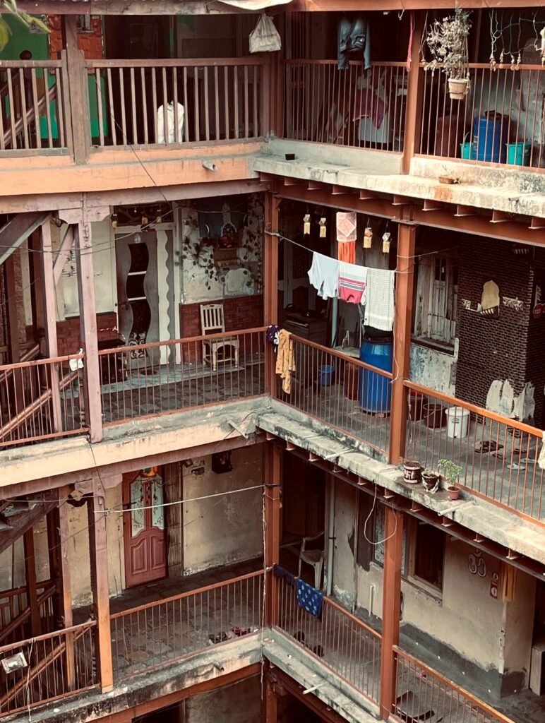
There are “turn off’s” in buildings just like there are in people. For me, the things I am going to list in this blog are things especially interior designers should watch out for.
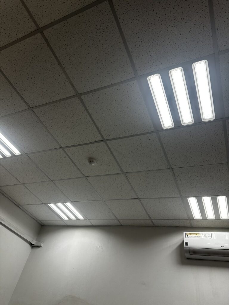
I will get straight into the topic. DO NOT use cold white lighting (flouresants). I cannot stress this enough. Not only does it make a space look like a butcher store or a supermarket, but it also creates an extremely unfriendly ambience inside the room. These lights make a space feel harsh and uncomfortable just like how you would feel in a hospital’s waiting room. I am especially talking some of the local restaurants in my country. Please avoid this mistake. No matter how good your food tastes like, the cold white lighting makes people pick the fancy Italian restaurant. Your restaurant is not a butcher or a toilet. 🙂
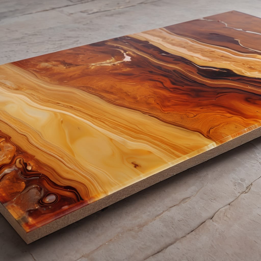
Fake wood or stone that obviously looks printed. Honestly, this is probably one of the biggest turn off’s in architecture. Not only because it is extremely obvious that they are fake, but also because they get worn out extremely quickly and look shaggy or dirty over time. At some point, using regular, plain walls would be the safest and cheapest option out there. I think using stone or quartz walls can be the best choice if you want to elevate the space. However, of course, you still have to consider the use of the building/space before jumping into the walls. Even the theme of the restaurant is extremely important. For example, if it is a Japanese restaurant you probably should not use bright light, matte walls. Using light wooden details, minimal rock decors (better if light gray), linen obeyed lightings and linen curtains, shoji paper -the light-colored Japanese sliding screens- and ceramic cups, plates, and small dishes. Also, even if you really have to use fake marble and stone, please do not go for the oversized printed veins, repeated patters, glossy plastic-looking finishes. Trust me, that will be noticed.
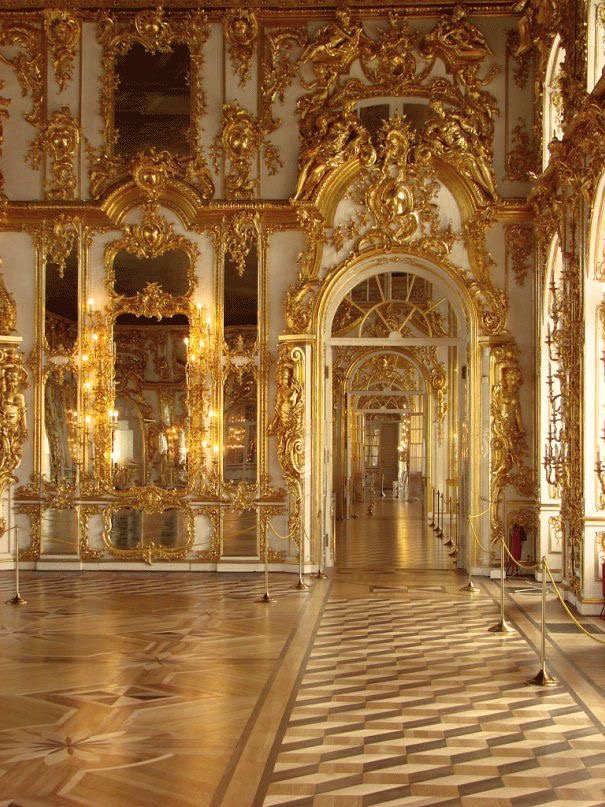
Talking about the fake materials, I really wanted to point this one out. Please do not use too much fake gold in your designs. I am not talking about having some gold details on your vase or tea cup. I am talking about people who design their houses using excessive gold like they are living in the Ottoman Empire. Obviously, if you are not living in a palace, gold touches in every corner in the house is extremely obvious that it is fake, and therefore it looks very cheap. To avoid this look, and if you really want to use gold, I would strongly think about the placements of the gold details. Make sure they are dispersed throughout the space and not clustered in a few corners.
This is not talked about enough: Using too many materials together. First of all, it looks poorly designed. A visitor would probably think the designer (or you) were indecisive on the material. Not that you can afford a lot of materials. I have a great example for this situation: (credits to Tupelo Honey on Pinterest)
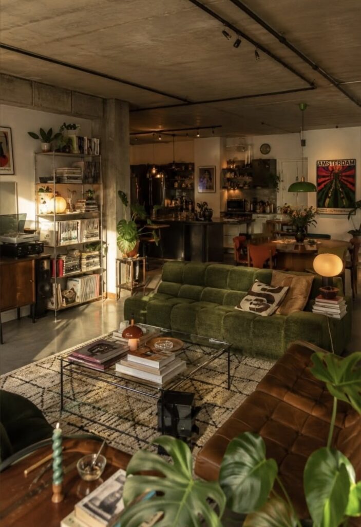
Although the colors are thought out, the materials create an extreme noise in the room. Your eye doesn’t have one clear place to rest. Instead, you have to focus on thousands of different details to be able to understand the layout, space, walking paths… There are lots of objects: books, plants, lamps, art, records, candles, cushions, flowers, kitchen items. And all of them have a different texture, style, vibe, color (even though the designer balanced the greens and browns out), and pattern. For example the patterned rug, tufted sofa, quilted leather chair, graphic cushions, posters. I totally understand that this can be a style, and no one can judge someone else’s art style. And my goal here is not trying to point out the weaknesses in someone else’s design. I am trying to guide people by telling how I think they can avoid the space looking cheap for people who aim for luxury (and again, I am not saying that the room above is cheap).
At the end of the day, a space does not look expensive because every material in it is expensive. It looks expensive when the choices feel intentional. Good lighting, a limited material palette, realistic finishes, and a little restraint can completely change how a room feels. Sometimes the best design decision is simply knowing when to stop adding.
Of course, design is subjective, and there will always be styles that break every “rule” and still work beautifully. These are just the details that personally make a space feel cheaper to me, especially when the goal is to create something refined and luxurious.
So before adding another marble wall, gold detail, spotlight, or decorative material, maybe ask: does the space actually need it?
